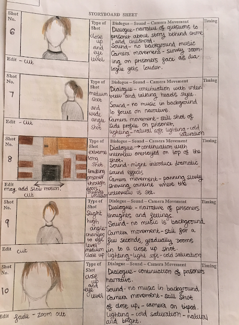
animated storyboard


Evaluation of my storyboard

I presented many diverse shots such as, close up, extreme close up, long shots, panning shots, high shots, low shots. I think this was effective as it built up a tense atmosphere and made my documentary more authentic by using shots that many of my inspired documentary examples use. I contrast close up shots and long shots because it creates suspension for the audience seeing conflicting shots of the prisoner's zoomed in face to a shot of the mise en scene to a long shot of the prisoner sitting in a isolated room. I decided to use a variety of shots exposing the harsh location and environment because it presents to the audience the harsh realities of prison life. I show different angles especially when it is shots of the prisoner in the interview because it characterises the prisoner in different light e.g. conveying her as evil and dominant or as vulnerable and suffering. 

 After creating my storyboard I decided that I wanted to do my interview with a black green screen as my background because I think it would look more professional and would match a crime documentary setting more. I think it would look more effective and realistic as many professional crime documentaries use a green screen to interview people. I may add shots of the canteen to portray that that's the prison's canteen and that is where the interview will be taking place. To improve the storyboard I would of added shots of the prisoner in front of a black green screen.
Also, due to permission for filming from the prison being too late so I may film at a nearby location near me that looks abandoned and a old prison.


Comments

  1. The detail in your storyboard is excellent Tillie, don't forget you also need this as an animatic. You can edit this together using the macs or just windows movie maker if a simple format would work for you.

    ReplyDelete

Post a Comment

Popular posts from this blog

Film poster analysis

Anchorage- words that accompany the picture e.g. 'The past never dies it kills' I think the anchorage is used as one of the main focus points of the poster because of the crisp white italics harshly contrasting against the faded black background. The colour tone and contrasting immediately catch the audiences eye. In addition, the short and snappy anchorage has a underlying dark message personifying the past which makes it interesting so, draws in the audience in. Preferred reading-   When audiences respond to the product the way media producers want/expect them to:   I feel that the audience responds to the poster with a burst of adrenaline and terror due to the graphic and eye- catching image which is the producers aim. In addition, when I first saw the poster I felt on edge and shocked at how realistic the image is. I think the producers aim for the audience to feel extremely on edge to convey the full effect of demonic possession and all the other underlyin...

Research of magazine listings

First Ancillary Task: my research of magazine listings This is a magazine listing I may use because I really like it's use of vibrant colour depicting each channel making it easier for the audience to find their chosen channel. Also, I think the 'Today's choice' at the left hand side works well being positioned at the start creating a lot of focus for the column. As well as loads of writing they use images making it more interesting and enticing to read as it breaks up the text. I do think the design is too clustered together making it hard to read, which is a negative of the listing layout. This is a magazine listing I may use because I like it's is of colorful puffs as there is diverse shapes adding excitement and interest. The puffs are filled with bold titles and important information readers 'need to know', which is a creative way to use text rather than bland and regular sentences. I think it's by using a bold striking black box to outline...

Evaluation Q3

What have you learned from your audience feedback? Target audience The target audience I looked at would be from 16-50, non-specific to gender, ethnicity or social class; This is the demographic of my documentary because of how widely varied it is and how many topics it covers that would interest any age, gender, class or race. I think as my documentary is of crime genre many ages are interested in this, which is why the age range is so wide. I don't think a crime genre documentary would be suitable for someone younger than 16 or older than 50 as I believe it would either be too frightening, uninteresting or wouldn't be able to understand the factual element to it. I don't think my target audience would be the social group who have a disposable income to more likely pay in order to watch it as people can easily watch the documentary for free on catch-up. I think my target audience would have to be interested in psychology (minds of criminals) and the crime system ...