
Evaluation: Newspaper Advertisement

Evaluation: conventions


Background


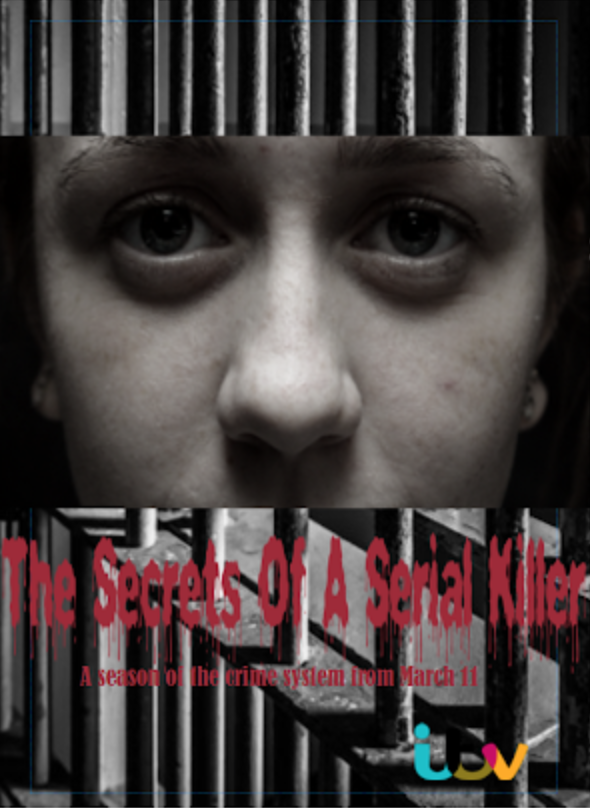
I chose my background to be of prison bars because it clearly indicates to the audience the ideas, themes and genre my documentary is going to be focused around. I think the black and white effect connotes the dark realities of prison and how harsh and shocking the crime system is reflecting the themes presented in my documentary. In addition, I admire how well the background blends with the rest of the advertisement as it contrasts with the bold red title, ITV logo and my main image.

Photo

I decided to use a extreme close up shot of the prisoner's face from a clip of the documentary because it is zoomed in and focused on the prisoner's intense expression, which draws in the target audience. I increased colour contrast and changed the filter to a black and white effect, which looks effective because as it blends in with the background and imposes fear onto the reader. 

Chose of layout

I decided to place the main image around the middle of the advertisement because I wanted to capture the audience's attention immediately as it's the main focuspoint. Also, I wanted the title to be near the bottom as it looks more professional so, I needed the image to be above the title around the middle. Through research, I put the ITV logo in the right hand corner at the bottom because I found many popular advertisements put the TV/ production logo at the bottom in the corner as it's not a supposed to be a focuspoint. I located the release date underneath the title as I think it works well close to the title. 

Title

I created the title so, it had blood dripping off the edges and looked creepy linking to the themes presented in the documentary. I changed the title to red because it connotes danger and fear, which provides the readers with a understanding with the themes the documentary is about.

Comments

Popular posts from this blog

Film poster analysis

Anchorage- words that accompany the picture e.g. 'The past never dies it kills' I think the anchorage is used as one of the main focus points of the poster because of the crisp white italics harshly contrasting against the faded black background. The colour tone and contrasting immediately catch the audiences eye. In addition, the short and snappy anchorage has a underlying dark message personifying the past which makes it interesting so, draws in the audience in. Preferred reading-   When audiences respond to the product the way media producers want/expect them to:   I feel that the audience responds to the poster with a burst of adrenaline and terror due to the graphic and eye- catching image which is the producers aim. In addition, when I first saw the poster I felt on edge and shocked at how realistic the image is. I think the producers aim for the audience to feel extremely on edge to convey the full effect of demonic possession and all the other underlyin...

Preparation for my evaluation Q3

I created a survey to get feedback from my target audience whether anything was missing from the documentary, what was interesting about it etc.. so I can get a better insight and narrow down the key codes of conventions that work well with my demographic. https://www.surveymonkey.com/r/Preview/?sm=ooVsOllCiFkUvXqIDC3bz_2BguCbKI5APsW_2BwUPUuAOZ136cZ0M9EGUyibbCH1DfcQ Overall this bar graph presents how women and men equally enjoyed the documentaries elements including the mise en scene, sound, characters and editing. I chose to make this study as I wanted to see who felt as though specific conventions worked effectively incorporated in my documentary. Overall, I feel as though my target demographic according to gender to equally halved, which enables me to look at both gender's interests and focus on all conventions in order for it to appeal to all my target audience. I chose to study the percentages of diverse ages that found my documentary interesting to focus and narrow do...

Interview with a serial killer analysis

This is a extreme long/slight ariel and high angle shot of Rochester New York State. The mise en scene presents an urban city landscape which presents the location of the documentary and implies that the prison is populated and big. The scenic view shows little colour apart from some greenery of the trees, this is because the frame is mainly of brown/beige plain and unsightly buildings. There is non- diegetic sound of police sirens and the buzz of traffic in the populated city. The police sirens show the audience the crime and trouble in this area linking back to this documentary about a serial killer. There is diegetic music which has a slow tempo, low pitch and repetitive beat which fades out as dialogue is introduced. The editing is quick and snappy as it cuts from different shots showing the variety of locations in New York. This is a medium long and eye level angle shot of the outside of the prison showing huge razor wire gates and large beige blocked buildings with cameras an...